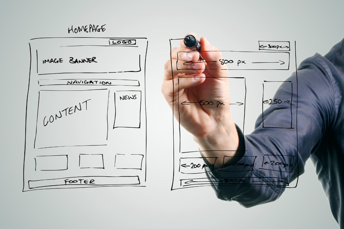
Web Design
Web Design
Interactive
Interactive
Animation
Animation


Subscribe
To receive email newsletters on upcoming UNCA events relating to technology and arts
Academic Partners

Graphic Design Tutorials
Print Type Photo Manipulation Illustration Branding
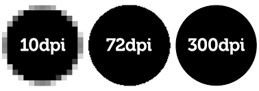
Printing High Quality Images and Resolution
Unlike images intended for the web, you want print images to be fairly large with very high resolution. 1020 px may look ok on a computer, but it isn't going to work well for large prints. 300 DPI or around 300 pixels per inch is recommended, so an 11x17 inch poster should be around 3300px across. In general, it is best to always save projects and files at higher resolution and cut it down when needed for web projects. Be sure to use CMYK colors for printing, and be aware that print ink is generally slightly darker than the images on a computer screen
Photography.Tutsplus: Understanding Printing Paper Types
Summit Printing Pro: Guide to Paper Types
PrintHandbook: Paper Sizes Chart

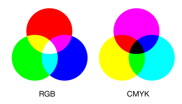
Color Models
Forget all the rules you learned in kindergarten about the primary colors being red, blue, and yellow. CMYK colors are Cyan, Magenta, Yellow, and Black. They are used for inks in color printing. CMYK is subtractive, meaning that the colors merge into black when added together, like mixing paints.
RGB uses Red, Green, and Blue. RGB is additive, meaning when the colors overlap they produce white light. RGB is based off of the physics of the light spectrum, and is used for stage lighting and images on computer screens and digital devices. RGB ranges from 0 to 255, with 0 representing black and 255 representing white.
The HSB color model adjusts variances in Hue, Saturation, and Brightness. It is also sometimes referred to as HSV, or Hue Saturation Value.
The HSL model represents Hue Saturation Lightness, with Lightness being the amount of white
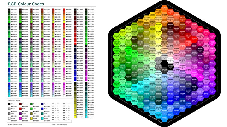
Hexadecimal
Lime, Blueberry, and Razzmatazz might make good names for crayons, but the names do not describe colors in a manner that is quantifiable. To address this, a numbering system was created for 16,777,216 colors in the spectrum. This allows accurate replication of colors from one project to the next. Because Hexadecimal is number based, it also conveniently translates well into binary.
On computers, Hexadecimal is set up so that each color takes up 8 bits, for a total of 24 bits. Every two space represents one color, so #F0AE66 would be three RGB colors F0 AE 66. The values range from 0 to 255, but since there are only two spaces per color, 255 has to be translated into base 16. Counting in Base 16 looks like this: 00 01 02 03 04 05 06 07 08 09 0A 0B 0C 0D 0E 0F. #000000 represents Black, #FFFFFF is White, #FF0000 is Red, #00FF00 is Green, #0000FF is Blue, #FF00FF is Magenta, #FFFF00 is Yellow, 00FFFF is Cyan.
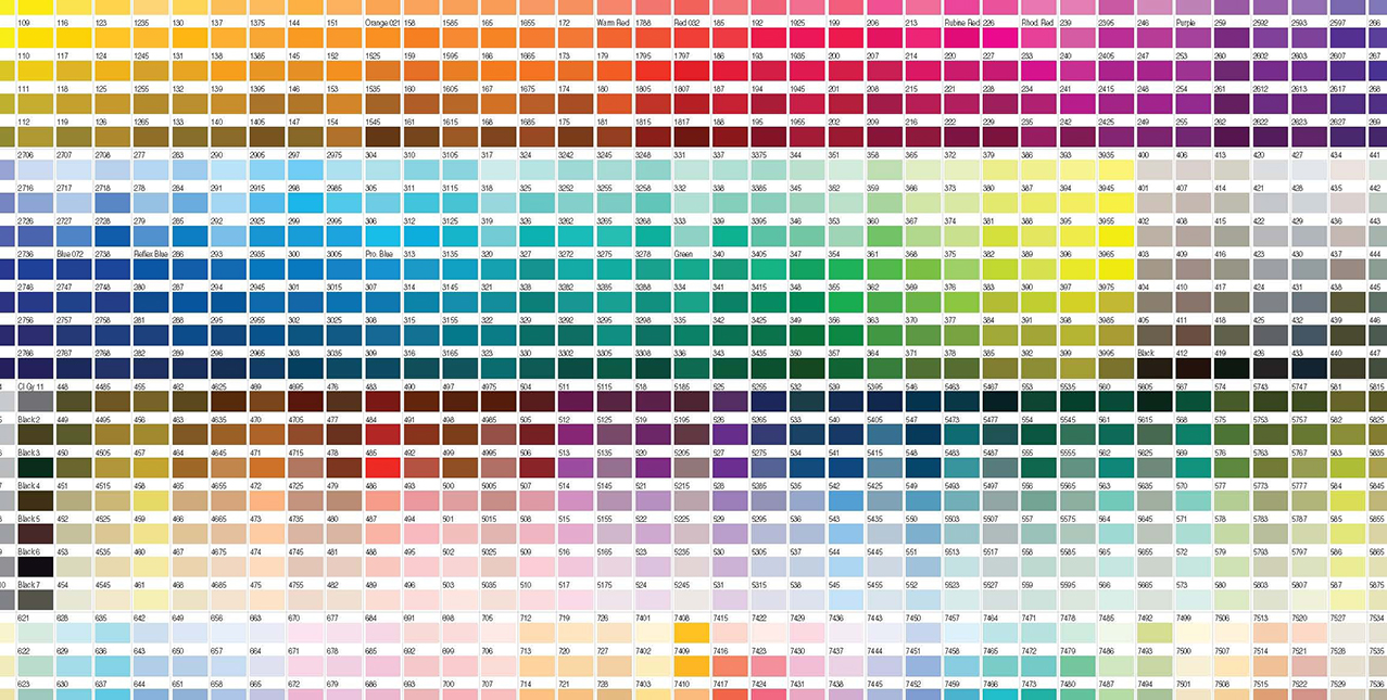
Pantone
The Pantone Matching System works the same way as Hexadecimal, except the color codes only apply to print, not digital. Hexadecimal and Pantone colors do not match up perfectly. Pantone swatches are intended to be used to keep colors used in branding or commercial products the exact same shades and tints. Graphic designers can also show Pantone swatches to clients and not have to worry about them later complaining that the color is different than what they asked for.
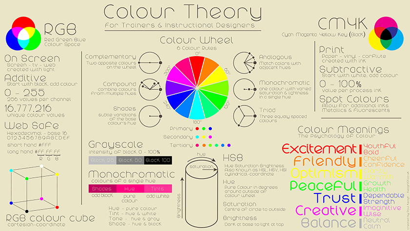
Color Theory
Choice of color scheme is very important in all realms of animation, design, and video. A lot of people don't realize how much color can alter the appearance of a design or composition. Sketches or thumbnails using just pencil or pen and paper might look ok in black and white or grayscale. But then when it comes time to add color, the colors you pictured in your head don't really work out so well in application. By then, it might be too late in the production process to try and go back and fix things. It is generally recommended to start introducing color studies by at least the final steps of pre-production. Don't wait until the last step.
Many designers keep a Pantone swatch booklet within easy reach in their studios. There are also many free online color scheme tools. Look for the hexadecimal number to duplicate exact colors. Creating color swatches and color schemes is useful for any design project
Blender Guru: Understanding Color
Color Relationships
Color Theory Continued
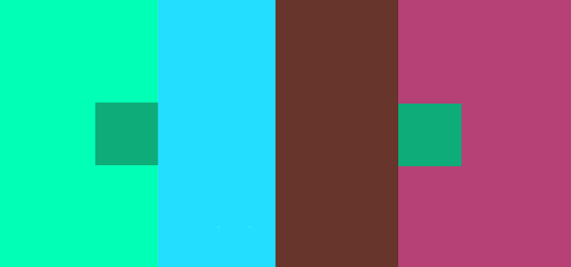
Josef Albers is credited for bringing serious scholarly attention to color theory in his book Interaction of Color. The book is filled with pictures of plain geometric squares of varying colors, illustrating how different colors looked side by side. Certain combinations of colors would cause two squares of the same color to create an optical illusion of appearing different shades. This effect has been termed the Law of Simultaneous Contrast. It's a principle to keep in mind when creating strong color graphics that pop.
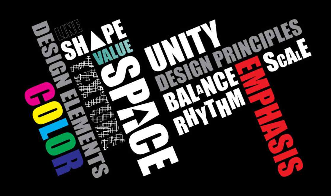
Elements of Art and Principles of Design
Familiarize yourself with these guidelines, or keep a printed out copy next to your computer or workspace. They form the core underlying theory behind all types of design.
The Virtual Instructor: Art Fundamentals
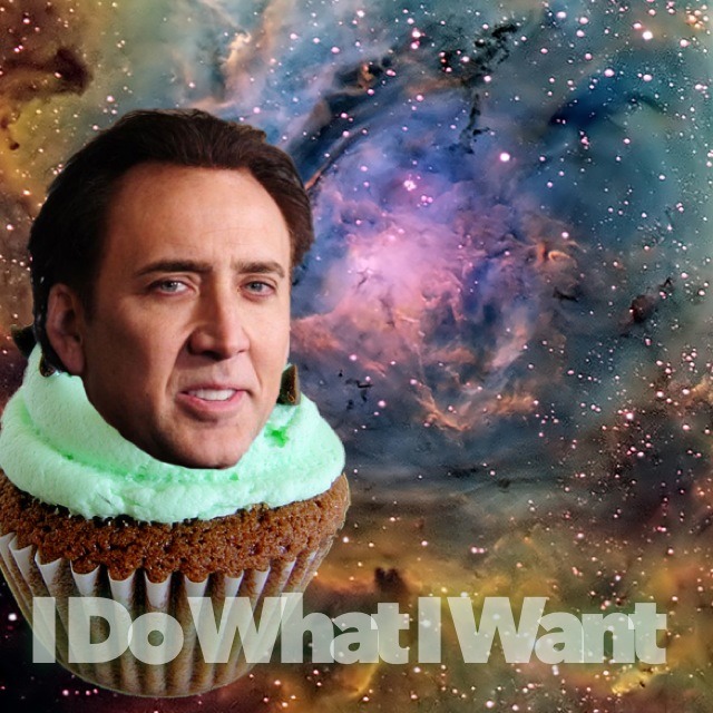
Removing backgrounds in Photoshop
You really want to attach Nicholas Cage's head to an interstellar cupcake for some reason, but you can't use the magic wand tool to remove the background without creating a pixelated edge. The struggle is real. You can clean up jagged edges using a soft edge brush or try using the polygon select tool. Masking is also an option.
Phlearn: How to Remove Anything from a Photo in Photoshop
The border edges of my logo aren't smooth
Use vectors, not jpgs. Vectors can scale to any size without losing resolution. The pen and blob brush tools in Illustrator can be used to make smooth curves better than by trying to draw curves freehand using a mouse or tablet. It is recommended to draw out designs by hand and scan them into the computer to trace. This method will save time adjusting details in Illustrator or Photoshop.
TechMindBlow: Introduction to Adobe Illustrator CS6
Matt Borchert: Pen Tool Tutorial
Creating Custom Brushes
Brushes can be used to create various types of line weights and texture effects. The main types of brushes are the default solid edge round brush, fuzzy edge tool, the pixel pencil tool, and the caligraphy pen. These tools are generally used for linework or cleaning up edges.
There are also various types of brushes that can imitate drawing and painting tools, such as the chalk brush, charcoal brush, bristlebrush, airbrush, acryllic brush, etc. These brushes tend to be used for adding texture or color overlay layers.
Illustrator and Photoshop come with a pre-built library of brush options, but it also relatively easy to create your own. Custom brushes are most commonly used for digital painting. There are endless possibilities for brush types
Hodgepodge: How to Make a Custom Brush in Adobe Photoshop
Matt Borchert: How to Make a Texture Brush in Adobe Photoshop
Trent Kaniuga: Brush Editor Tool
Scott Robertson: Advanced Brush Settings
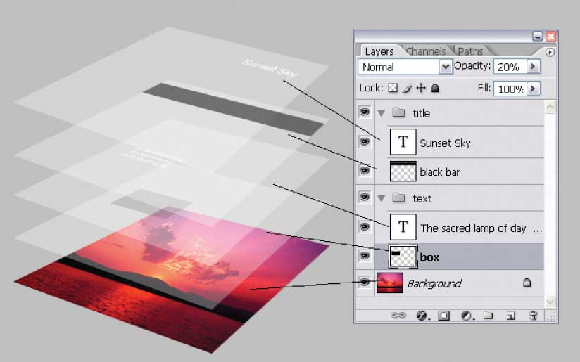
Layers
Where traditional artists can only paint or shade layers by working from a base layer up, digital artists can add, remove, or change the opacity and colors of individual layers in any order with ease.
It is recommended for digital painting to keep linework and color layers separate, and to keep backgrounds separate from the subjects. This makes it much easier to make adjustments quickly. Layers can be flattened and merged together. Applying filters and transparency causes different blending effects.
IceflowStudios: Clipping Masks VS Layer Masks
Background isn't transparent
No worries; you probably saved as a JPG instead of a PNG. PNGs can use a transparent alpha channel as a background; JPGs cannot.
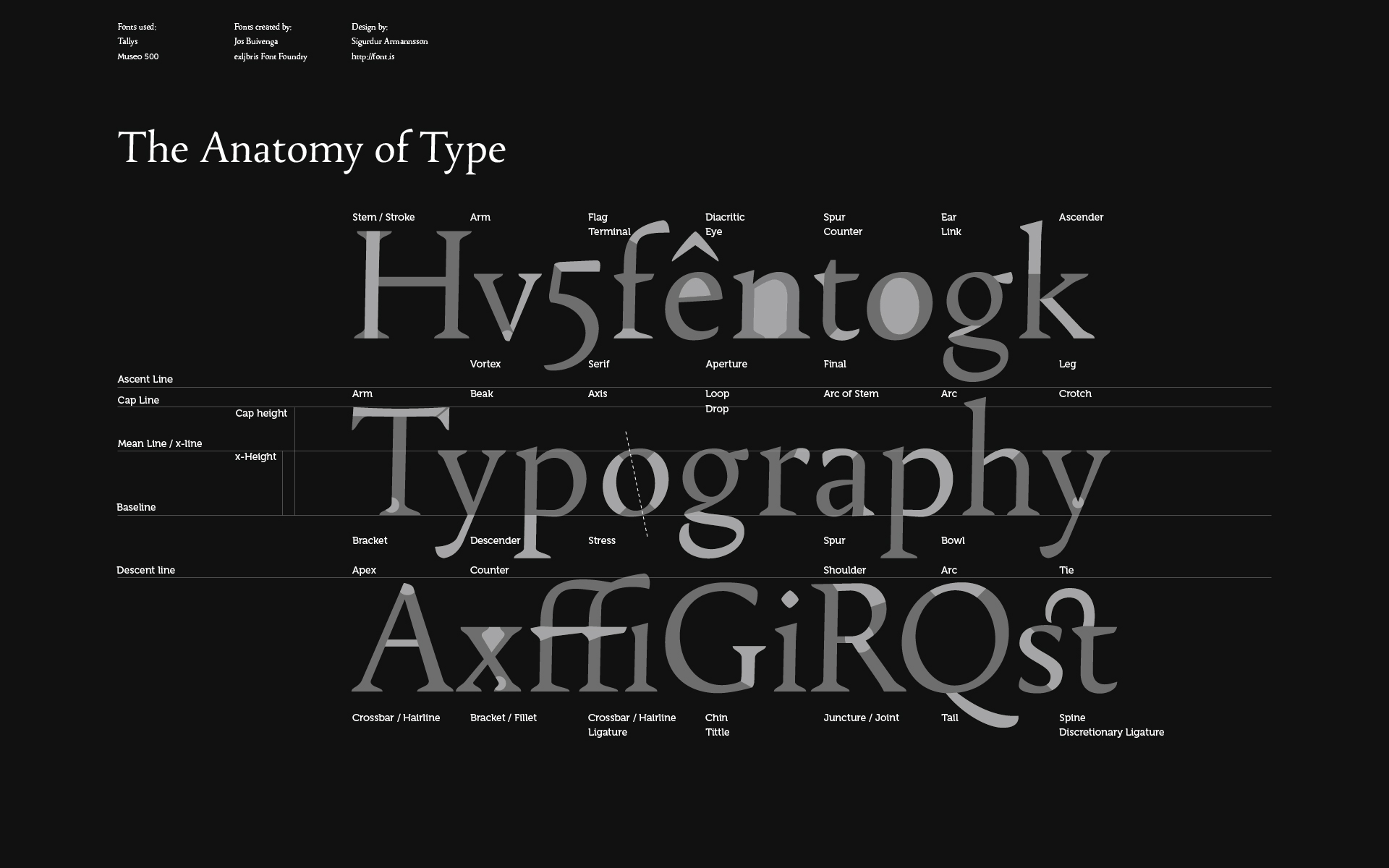
Typography
Typography is the graphic designer's best friend, and worst enemy. Graphic designers spend an unhealthy amount of time browsing through font libraries, trying to find that one perfect font.
There are hundreds of thousands of typefaces and font styles to choose from, ranging from formal sans serifs to the grotesk. However, sometimes a designer just has to create an original typeface to get the specific look they want. Creating a typeface generally starts with hand drawn lettering. Once you have created a number of thumbnail sketches and picked the style you like to upload into Adobe Illustrator, it can be traced and fine-tuned using bezier curves and pen tools. This step will probably take a lot of time struggling with adjusting the little anchor points and paths, but as you become more familiar with the program it gets easier.
Design Instruct: 10 Infographics That Will Teach You About Typography
Typewolf: The 10 Most Popular Web Fonts of 2015 (And Fonts You Should Consider Using Instead)
Tobias Frere-Jones: Gotham
The History of Typography - Animated Short by Ben Barrett-Forrest
Will Paterson: Perfect Curves With The Illustrator Pen Tool
Wikihow: Download Fonts
DaFont: FAQs
Logos and Branding
Successful branding requires applying a consistent style across multiple products. This may be a unifying color scheme, font, or pattern. A lot of people think that a perfect logo will somehow make their business more successful. It certainly doesn't hurt, but great products and service are really more influential factors.
Vox: What makes a truly great logo (with Michael Beirut)
Karen Kavett: How to Design a Logo
BoredPanda: Famous Logos Then and Now
Becky Kinkead: 10 Logo Design Tips
Just Creative: Brand Identity
Layout
Layout is the key to good 2D design. Whether designing posters, promotional materials, magazine pages, or product packaging, a rectangular area is typically what a designer will have to work with. In that space, it's really up to you what fills up the blank page. Grids, white space, and balance are things to consider. Unifying themes are useful for variants or multiple pages. If there is any writing, it needs to be legible. Text often gets lost when placed over busy backgrounds like photographs. A dark outline or contrasting color change might help remedy this, or just do the simple thing and use a solid background.
Good design is functional, but great design takes risks and stands out when people see it. The placement of every element should look like an intentional design choice that leads the viewer's eye.
Print, Engraving, and Handmade Type
Creating woodblocks and stamps involves rudimary drawing skills to design the image. The tedious part is carving out all the details. Raised relief is used for stamping flat solid shapes like color or text, while engraving offers finer detail and shading. Carving and etching takes a long time to do and is very unforgiving of mistakes, but the resulting template can be printed repeatedly, which in the long term is cost effective for selling multiple copies. Metal templates last much longer than wood, but rubber and plastics are modern materials that do the job just as well.
Printmaking is somewhat of a dying commercial profession, though individual artists can still pick up the trade with the right tools. The machines and equipment may be obsolete now, but the actual design process is far from dead, and has potential to continue on in a new form through digital technologies like computer fonts, lasercutting, and 3D printing.
Danny Cooke: Upside Down, Left To Right: A Letterpress Film
Tested: The Craft of Letterpress Printing
CreativeTechs Weekly Webinars: Letterpress
"Linotype: The Film" Official Trailer
Minneapolis Institute of Art: Lithography Printmaking Process
Art Gallery of NSW: Ukiyo-e woodblock printmaking with Keizaburo Matsuzaki
MOMA: Intaglio Process
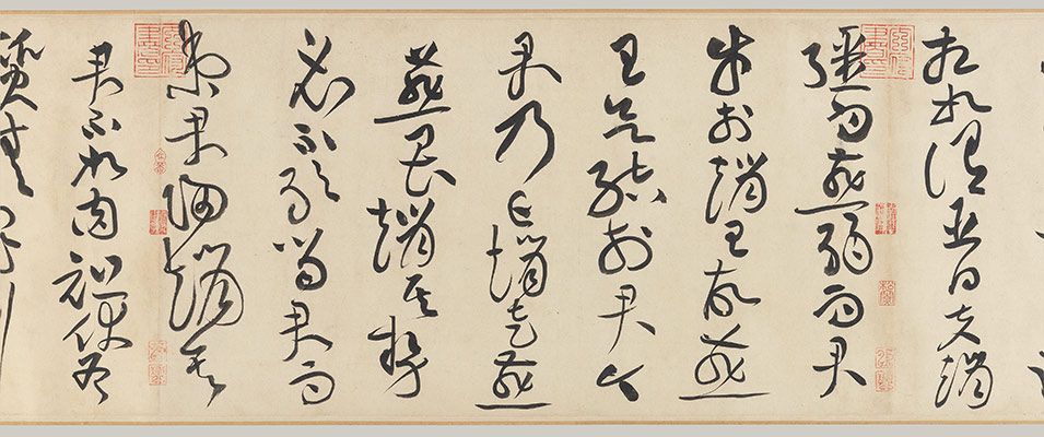
Calligraphy
Handwriting is still around, and while most people's handwriting isn't very legible, writing is in no danger of disappearing in spite of computer keyboards and texting. Calligraphy takes years of practice and patience to learn, but it can be an asset in creating dynamic and fluid font styles. The tried and tested method for learning cursive and handlettering is by copying the alphabet over and over again. Because calligraphy uses ink or markers, it is not possible to erase mistakes. You have to start over from scratch.
There is a fundamental difference between traditional calligraphy and interpretive modern calligraphy. Traditional calligraphy in China, Japan, Korea, and parts of the Middle East follow strict conventions that have been passed down for generations. Writing is regarded with great significance as an artform and a serious lifelong study. Aspiring calligraphy students must learn how to grind ink, meditate, prepare the paper, properly hold the brush, and let brushstrokes flow out of the body on the proper direction and manner. Only when the calligrapher discovers balance and harmony with the brush strokes can they start experimenting with their own interpretative styles.
Graphic designers have to work efficiently, so adherence to cultural authenticity is unfortunately not always the viable option. Cheating by using Illustrator to make fine adjustments to letterforms is perfectly acceptable.
Scribble: Calligraphy Rule Lines
Scribble: Calligraphy Tools
Scribble: How to use a Fountain Pen
Scribble: How to choose a Calligraphic Script
Scribble: Brush Lettering
Scribble: Decorative Flourishing For Calligraphy
Hamid Reza Ebrahimi: Copperplate
Asian Art Museum: Appreciating Chinese Calligraphy
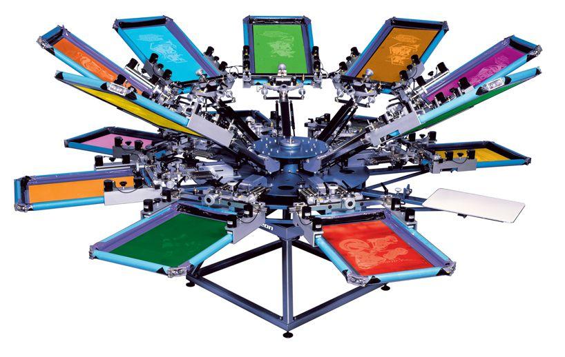
Printing T-Shirts
There are a number of different ways to print graphics on T-Shirts. Silkscreening is probably the most popular method used in commercial products.
NateScreenPrints1: Screen Print at Home
Custom Logo: Screen Printing Multicolor T-Shirts Part 1
Custom Logo: Screen Printing Multicolor T-Shirts Part 2

Industrial Design
Form follows function. Commercial design epitomizes the modern aesthetic. Products are designed so that every component serves a purpose. Designing commercial products requires a general understanding of drafting, design, and engineering.
Advertising
The goal of an advertisement is to get people's attention and hold it just long enough to convey a snippet of information. There are different ways to do this. One strategy is to make a cool artwork that people will likely spend a few seconds looking at the details before they glance to see what the writing says. Other advertisements make the brand name the most prominent feature, with very little written information. The third type of advertisement will have a lot of information, like upcoming calendar dates for concerts, with some kind of graphics in the background to serve as visual interest.
Canva Designschool: 50 Genius Print Ads With Brilliant Design Techniques
Branded3: The top viral marketing campaigns of all time
The Atlantic: Why Good Advertising Works (Even When You Think It Doesn't)
Successful Marketing Campaigns
HBR: Creativity in Advertising
Infographics
Infographics have technically been around for a while in the form of simple public street safety signs, maps, and graphs. However the modern infographic really was born out of the 1980's-1990's proliferation of Public Service Announcements and flyers, combined with the commercial availability of PowerPoint and vector graphics at the turn of the century.
The problem with traditional infographics is that no matter how aesthetically pleasing the designer makes the visuals look, the content is still the most essential component, and there are only so many ways to make statistical data interesting to the average person. Infographics frequently get overlooked because they are still too much like advertisements, which might be relevant to a select audience but are a nuisance to everyone else.
The area where infographics really shine is in detailed fan artwork and pop culture references. These infographics are extremely popular and get shared quite a bit online. The amount of time spent researching often adds up to more than the total income sales, but people do appreciate the effort. There is still a healthy commercial market for all types of infographic design in posters, flyers, presentations, academic journals, magazines, commercials, and textbooks.
CreativeMarket: Infographics about Design
Super Graphic
Röyksopp - Remind Me
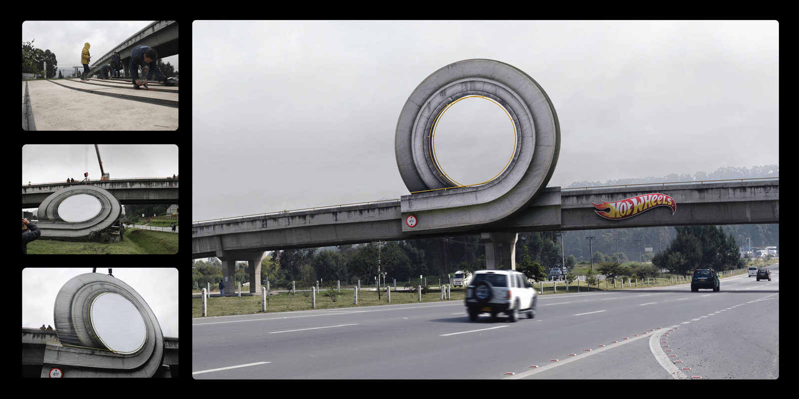
Billboards
Designing billboards follows the same design principles as creating posters or magazine ads, but on a larger scale. Billboards used to be hand painted, but thanks to lithography, screen printing, and more economical durable materials it is now possible to print and assemble large signs relatively quickly.
Billboard dimensions and placement are regulated by the government, but the content is not. This has resulted in a lot of complaints about controversial or inappropriate ad campaigns. Shock value ads grab attention, but they don't make anyone more likely to purchase a product. Art and funny advertisements are more effective at building positive brand image.
Many designers have migrated into the sign-making business due to the creative freedoms the profession affords.
Madehow.com: Billboards
AIGA: A New Generation of Designers are Escaping their Computer Screens to Paint Signs
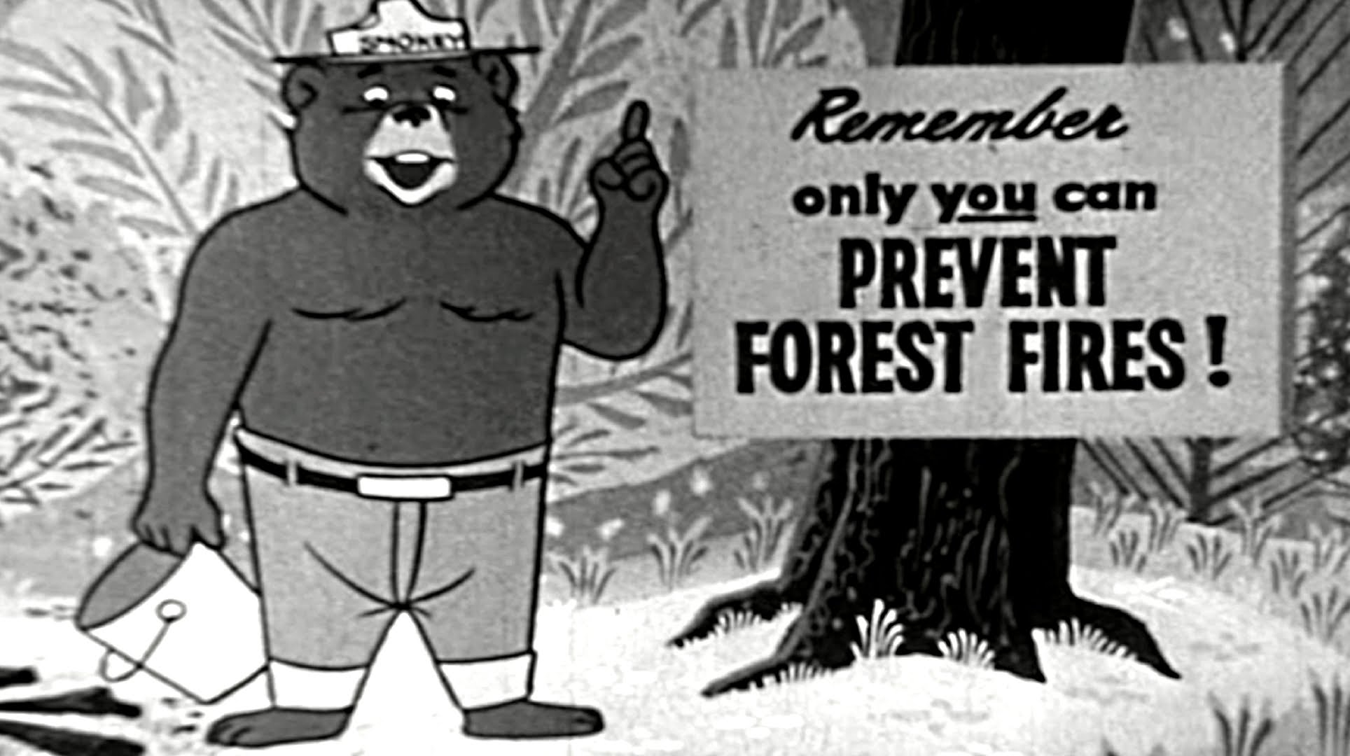
PSAs
Public Service Announcements are non-profit educational materials in the form of pamphlets, posters, commercials, billboards, etc. They are typically used to bring attention to serious issues that society tends to not want to think about. There is a very fine line between creating an ad that is powerful and one that just makes people upset. Most PSAs seek support for a charity or cause, so alienating the audience doesn't help anyone. Ads that use guilt-shaming or are overly negative get attention, but they are not always shown to significantly increase action to resolve the problem.
The most successful PSAs are the ones that give the audience a choice by making resources and information readily available, usually in an attached website link. They also tend to have positive messages or humor, which people are more likely to share online. PSAs have resulted in many major changes to laws and public awareness in society, so they can be very effective. This puts a lot of responsibility on the designer to be responsible and informed about the way the issues are presented.
Banksy
Stencil ArtDisclaimer: Graffiti and gang tagging are considered illegal and a form of property damage. Trespassing on private property is also against the law. Always obtain legal permission before creating any public art that might be considered vandalism. Many abandoned buildings have unstable architecture, broken glass, wild animals, trash, spilled chemicals, barbed wire, rusty nails, and other dangerous stuff. End Disclaimer
Most street art is created using stencils, which are simply paper or cardboard cutouts that are made by tracing over a printed out image. Stencils also take less time to spraypaint, reducing the amount of time graffiti artists spend at the scene. Street artists generally have an intended message they are trying to send with their art.
Scale often plays a major factor in street art, so street artists should plan to bring lots of paint and a ladder. Typically street artists wear a respirator or handkerchief over their mouth and nose to avoid inhaling paint fumes and to remain anonymous. Most artists use an alias to sign their work.
Instructibles: Creating Complex Spraypaint Stencils by Hand
Tribe Tyler Intro to Stenciling
Graffkit: Make a Graffiti Mop
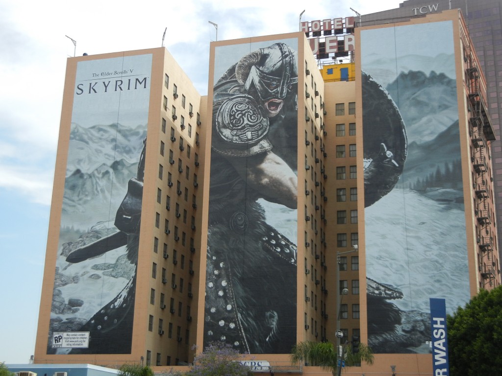
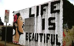
Urban Art and Murals
Urban art is usually created in abandoned buildings and difficult to reach areas, so artists can take a little more time to paint elaborate murals. It is usually easier to get permission to paint on condemned buildings since they will either be torn down or repainted by new owners anyway. Photographing work is an important step to documenting the artwork, since urban art can be painted over or defaced at any time. It is generally understood that urban art is temporary.
Mural advertisements are an alternative to billboards that get a lot of publicity in metropolitan areas, so many businesses are actually starting to sponsor urban artists. The building owners get paid for the ad space, and the artists get a hefty paycheck, which is a pretty significant shift in attitude from when anyone caught painting on the side of a wall would be prosecuted.
The secret to painting giant murals is breaking things down into smaller sections, using a proportional grid system, and having helpers to finish the job more quickly. A lot of preplanning is required for any large-scale project. Safety is also important to keep in mind with tall buildings.
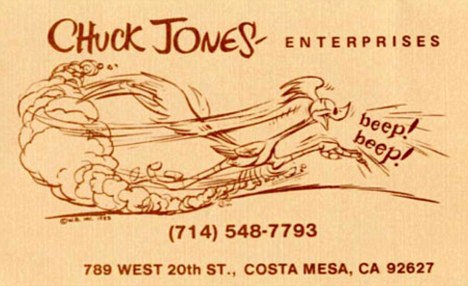
Business Cards
As a designer, 95% of your time will probably be spent anonymously developing the public images of companies and other people. This is why it is important to create a strong brand for yourself that is unique and all about your interests. Business cards may not be used as frequently as they once were due to smartphones and online career sites like LinkedIn, but having a calling card with your contact information and your name still makes a statement.
Printaholic: 15 Famous Business Cards
American Psycho: Business Card Scene
Design Aesthetic
A lot of websites will offer "10 easy ways to become a better graphic designer." Ths is slightly oversimplifying the process. Design is extremely complicated and hard to define. It takes methodical planning, but the best designers also rely on intuitive choices. There are no rules to follow that will automatically make a design succeed, and any logo, poster, or font that looks effortless probably went through a whole lot of discarded ideas and revisions to create.
Another side effect of following prescribed design guidelines is that designs tend to all come out looking the same. Students are taught to imitate the styles of successful professionals or to produce the kind of generic work that sells, instead of developing their own unique look that will stand out. Even though the designer should always seek to put the client's interests first, doing nothing else besides creating soulless, self-effacing corporate logos over and over will not make for the most satisfying career. The best designers are the ones who are smart about choosing clients that allow creative freedom. These designers create their own unique stylistic brand that businesses see and want to adopt.
Break the rules and do something different. Helvetica may always be a reliable font, but it is a safe choice that's been done before. You're never going to distinguish yourself as an individual doing what everybody else is doing.
Design School: 10 Rules of Composition All Designers Live By
Advanced Tutorials- Hopefully Coming Soon
Graphics
The Design Revision Process
Illustrator Tools
Scanning images
Layers
Shortcuts
Grid Tools
Clone Stamp Tool
Gaussian Blur
Magic Wand and Lasso Tool
Canvas Size, Scale, and Resolution
PNG, JPG, GIF
Grunge
Vector Art